skip to main |
skip to sidebar
 On Saturday I happened to be passing by one of my new favorite stores, Desert Island Comics, and decided to stop in on a whim. I left with a stack of books, including this collection of Gary Panter prints. I'm not quite sure what the deal is with this publication, as there's no information printed anywhere on it. I thought maybe it was called "The Waters Leading to Hell", but I think that's actually the title of the painting on the cover, rather than the book. But it's over-sized (about 11.5 x 15), staple-bound, printed on heavy paper, and looks awesome!


 As a bonus, I was invited to choose from a box of "weird, 80s music trading cards" and managed to score this one of Harley Flanagan from the Cro-Mags. Pretty awesome (and yes, weird).
 I've been watching the work of illustrator Nigel Peake for a little while now--I've previously written on here about his Ghost Houses and one of his zines. This short collection of drawings is themed on maps, which I'm particularly interested in--though Peake's maps are not the typical kind.
 From the book: "Documenting small time adventures and excursions outwith a mile radius from where I call home. From train rides facing backwards, to crammed bus rides in tiny hill-top towns, to bike rides through the backyards of Europe. Records of the vast, unyielding concrete miles of Shanghai, to the paths between mountains and forests in late night French countryside to the old paint splattered wooden floor in London that I sleep on from time to time. In addition to this there are also some imaginings of possible places - cities built from train tunnels and underground arches to invisible concrete cities."
 I love the illustrations, the different interpretations of maps, the watercolor lettering, the colors.
 "What makes Nigel's maps so beguiling is the delicate poise between politics and imagination. Each map, he says, is a 'fictional reality.'" (From an essay in the middle of the book)


 This 90-paged full-color book (which doesn't seem to have a title) is a record of a 2004 Barry McGee installation at Brandeis University. McGee, a San Francisco-based painter and street artist who is associated with the Beautiful Losers scene, has been influenced by Mexican muralists, hobo graffiti, skaters and surfers, and it shows in his art.
 The book reflects the various aspects of McGee's work--his graffiti and paintings, alongside snapshots of detritus, urban blight, and desolate street scenes.
 I love this one on the right.
 The photos and graffiti help set the tone, but the best part is the paintings, the weird, abstract faces,
 juxtaposed with bold geometric patterns.
  This is a gorgeous book, full of color and life.
 Henry Darger is the quintessential outsider artist. He grew up an orphan, escaped from the asylum for "feeble-minded boys" at age 16, led a mostly solitary life working as a janitor, and lived alone in a one-room apartment in Chicago for 40 years. Upon his death his landlord discovered that the tiny room contained more than 30,000 pages of manuscripts and several hundred watercolor paintings. Most of them comprise his most famous work, In the Realms of the Unreal, the story of the Vivian girls, seven sisters who assist a daring rebellion against an evil regime of child slavery.
What most people remember about the paintings is that the little girls have penises. I'm not a betting woman but if I had to put money on it I'd guess that Darger just never learned that girls don't look the same as boys. But I digress...the important thing is that he was a total unknown with an incredible secret life, spending decades writing and painting his life's work without another soul even realizing it. I first heard his story about ten years ago, and became fairly engrossed in it. I was at first disappointed to learn that the In the Realms of the Unreal has not been published in full (although, quite frankly, how could one publish a 15,000+ page book--and more importantly, who would read it?) but did manage to find a volume excerpting sections of it at the Pratt Library, where I worked at the time. Anyway...about a year ago I was in the PS1 book store and noticed this on the shelf. It was a little bit pricy but it was well worth the purchase. It's a beautiful little book of, yes, photos of Henry Darger's room, which his landlord has faithfully kept nearly just as it was when Darger died in 1973. It starts with a series of black and white shots, taken in the 70s just after Darger's death. I like the inspiration wall on the right. Darger was obsessed with protecting children, which, knowing just a bit about his history in the asylum, seems pretty understandable.
 Most of them were taken in 1999 and are in color, with this almost golden sepia tone to them. I love how his paints are still strewn out on the table, as if he might come back to them at any minute.
 Some original manuscripts of Realms. Some of them were bound by the artist; the rest are tied with twine. I like the wallpaper covers with hand painted titles.
 Darger loved children's books with girl protagonists. He owned 13 first edition copies of the Oz books.
 Photos of little girls and religious images on the mantelpiece.
 This new edition of Keith Haring's Journals marks the 20th anniversary of Haring's death. After a few years working in publishing, the cynic in me imagines some editor looking through the backlist catalog and saying, hey, next year we can publish a fancy new edition of this book and call it a 20th anniversary edition and sell a lot more copies! Of course, the upside is the renewed attention to Haring's work that this brings about.Anyway, it really is a beautiful package--the drawings on the front are debossed (that is, indented into the paper), which creates a lovely tactile sensation. As for the contents of the book, the journals span from 1977 to Haring's death in 1990. But they skip about quite a bit until 1986, when Haring began writing more regularly (1983 and 1984 only take up two entries and there are none for 1985). As a result, the bulk of the book covers the years when Haring was already famous. There's not much of a gradual rise to prominence--suddenly it's just there. I would have liked to read a little more about his early years in New York, before he was running around the world creating high profile murals and museum shows; at the same time, his voice does not change from beginning to end. His opinions and feelings seem unaffected by it all. Much of the entries read like a tedious cataloging of his shows as he travels the globe to create art, but are made interesting by his observations of people, politics, and art.
 Here's one of the French flaps. You can see the indentations from the debossing all the way to the right.
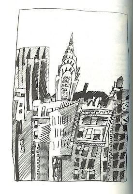 One of Haring's early drawings from the late 70s. I really like this one, even though it's not indicative of his more well known style.
 I love this picture, how he's literally painted himself into a corner.
 An illustration from 1984, in Haring's classic style.
 His illness is hardly mentioned at all in his journals. It is first brought up offhandedly when a dentist accosts him for not mentioning it before he begins to work on his mouth, and then again in September 1989 (five months before he died) when he says "In light of the new information I received last week about my health, I know I owe it to myself to think for myself for a change." That is about the most in-depth he goes in expressing any worries about his illness and mortality (though I imagine he must have had much more serious thoughts about this--just not on the page). He died incredibly young, and yet he had such a prolific career, despite its brevity. And yet, one has to wonder what might have been had he lived.

 On Saturday I happened to be passing by one of my new favorite stores, Desert Island Comics, and decided to stop in on a whim. I left with a stack of books, including this collection of Gary Panter prints. I'm not quite sure what the deal is with this publication, as there's no information printed anywhere on it. I thought maybe it was called "The Waters Leading to Hell", but I think that's actually the title of the painting on the cover, rather than the book. But it's over-sized (about 11.5 x 15), staple-bound, printed on heavy paper, and looks awesome!