
 My first introduction to William T. Vollmann came in an interview in BookForum about five or six years ago. I was intrigued, and decided to start with the then recently published Expelled from Eden, which collects excerpts from all of his novels, as well as essays, journalism, interviews, and letters, providing a window into Vollmann's voice, style, and breadth of work. I'm not sure I read the whole thing (certainly not straight through), rather leafing through it, reading bits of it here and there. Since then I've endured a number of his books (I think endured is the right word--while beautifully written, the subject matter is often bleak and horrific) and intend to read more. Eventually. I haven't worked up the nerve to tackle Imperial yet (1,200 pages about the California county right on the Mexican border) but I'll get there.
Monday, March 14, 2011
Expelled from Eden by William T. Vollmann
My first introduction to William T. Vollmann came in an interview in BookForum about five or six years ago. I was intrigued, and decided to start with the then recently published Expelled from Eden, which collects excerpts from all of his novels, as well as essays, journalism, interviews, and letters, providing a window into Vollmann's voice, style, and breadth of work. I'm not sure I read the whole thing (certainly not straight through), rather leafing through it, reading bits of it here and there. Since then I've endured a number of his books (I think endured is the right word--while beautifully written, the subject matter is often bleak and horrific) and intend to read more. Eventually. I haven't worked up the nerve to tackle Imperial yet (1,200 pages about the California county right on the Mexican border) but I'll get there.
Wednesday, March 9, 2011
Type and Typography by Ben Rosen
 I bought this typography book at an estate sale a couple of years ago. (Please excuse the slightly blurry and unappealing photo.) The books were so cheap that I just kept adding more to my pile (I walked out of there with more stuff than I could carry and it all came to about $8). A 1960s typography book? Why not? I'm not a graphic designer but I do have an appreciation of type and letters in general, and lately find myself paying more attention to the typefaces that I use and what they communicate.
 A closer look at the logo on the front, which I love. Although I must say, I love the front of the paperback edition even more.
 Most of the typefaces showcased in the book are pretty basic--this book was published nearly 50 years ago after all--though still widely used today. (By the way...I just noticed that the letter R appears twice in the above example. Anyone have any idea why?)
 There's also something I find visually appealing about looking at all of these alphabets, especially when some of the letters are blown up to be very large.
 There are also a few pages illustrating how type can be used in advertising and other commercial work, and that's where it gets a little more exciting.
Monday, March 7, 2011
The Lime Twig by John Hawkes
 The Lime Twig is a surreal, avant-garde novel melded with pulp crime fiction. (Many a review describes it as something like Dick Francis meets David Lynch.) The basic story—a race horse heist gone horribly wrong—is told in nightmarish, impressionistic sequences. The cover of the book, featuring a grainy, blurry mess of images that only come into focus when you really concentrate, is a pretty apt translation of my experience of the book.
 I can't remember how exactly I first came across John Hawkes—in some chain of online links—but only a couple weeks later I found a copy of The Lime Twig in a used bookstore and excitedly picked it up, thinking it a nice coincidence. As I was paying for the books, the store owner stopped at The Lime Twig and got a funny smile on her face as she explained that John Hawkes had been her college writing teacher (which explains why the book was prominently displayed on the wall). I'm not really sure of the point of that story but it's what I remember most about the book when I see it.
Wednesday, March 2, 2011
The Friend of Madame Maigret by Georges Simenon
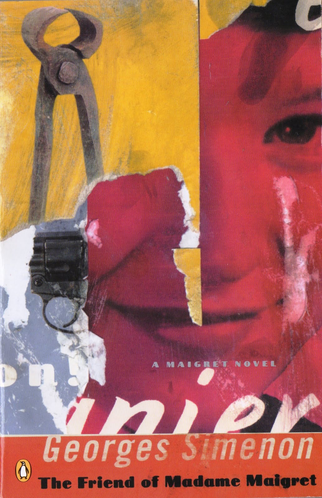 Georges Simenon might be one my most read authors, maybe because he wrote so many books--around 200--and because they're so incredibly readable (and short). I picked this one up on a shelf at work not long after reading an article about him in BookForum, so it was a nicely timed find. One of 75 novels starring the fictional police detective Inspector Maigret, this one was written in 1949, about midway into Simenon's writing career. In an increasingly complex investigation, Maigret attempts to prove that a murder has been committed, even though no body has been discovered.
Revisiting this one makes me want to crack open another Maigret novel. I've got at least a few more unread ones on the shelf.
Tuesday, March 1, 2011
Kramers Ergot #5
 Kramers Ergot began as a self-published mini-comic and has grown into a full-sized, extensive comics anthology, and is only getting thicker and more extravagant with each new installment. The fifth issue includes work from twenty contributors, including Gary Panter, Marc Bell, Chris Ware, Ron Rege Jr, Tom Gauld, and Kevin Huizenga, among others. It's a pretty amazing collection.


 I love how colorful this one is, particularly the spine.
  The back.
Subscribe to:
Comments (Atom)